Työn nimi
Tuudo - One App for Smoother Student Life
Työn ilmoittaja
Hellon, Nordinary
Asiakas
Tuudo
Kilpailukategoriat
Paras digitaalinen palvelu, Paras palvelumuotoilu, Paras käyttökokemus, Paras brändi-identiteetti

What is Tuudo?

Tuudo started in 2015 as an internal project at the University of Oulu — with a different name and a simple goal: to make student life smoother.

Fast forward 10 years and Tuudo is a trusted partner of over 40 educational institutions across Finland.
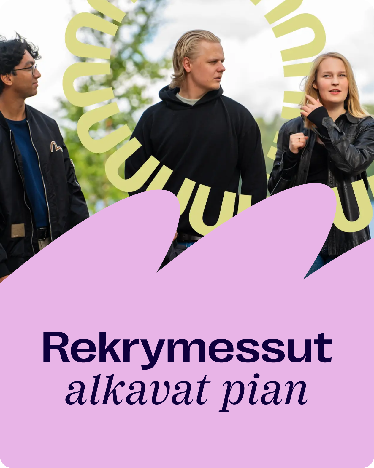
Hellon's challenge was to redesign the Tuudo mobile app —bringing clarity, scalability, and usability to an experience shaped by multiple stakeholders with competing needs and objectives.

Navigating this complexity required more than design execution; it demanded deep collaboration. Through a co-creative service design approach, we aligned strategic goals with real user needs, transforming a complex ecosystem into a coherent, impactful experience.

43
educational institutions

30 higher education institutions and 13 secondary-level schools across Finland

420k+
unique users annually

Tuudo reaches students nationwide throughout the academic year

300k+
monthly active users

A large, engaged user base relying on the service regularly

65%+
daily usage rate

For most users, Tuudo is part of everyday student life, not an occasional tool

Calendar

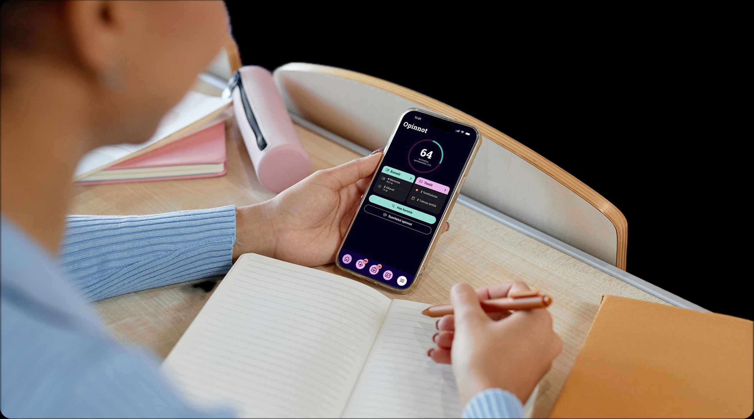
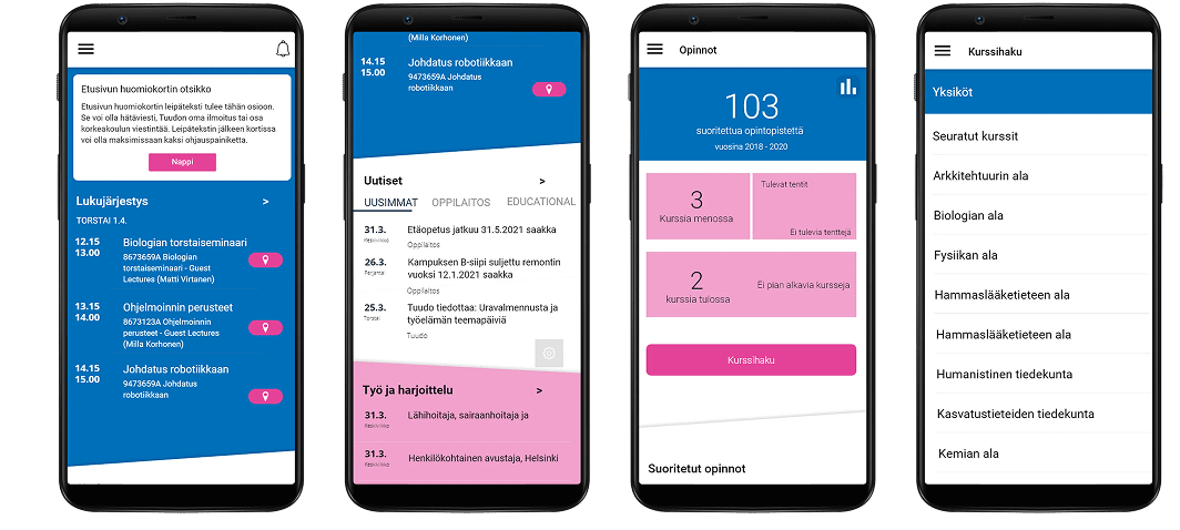
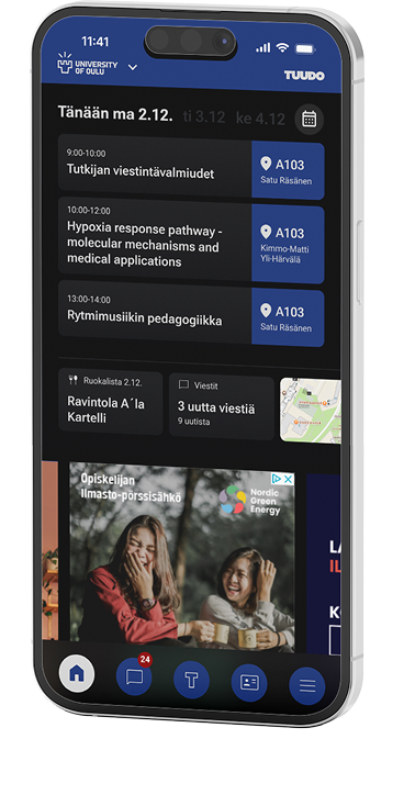
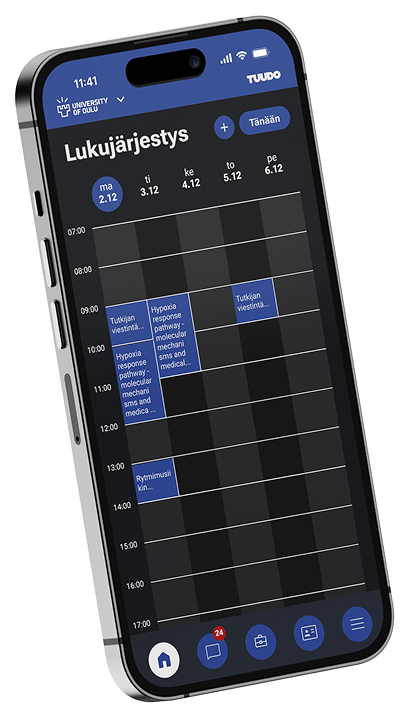
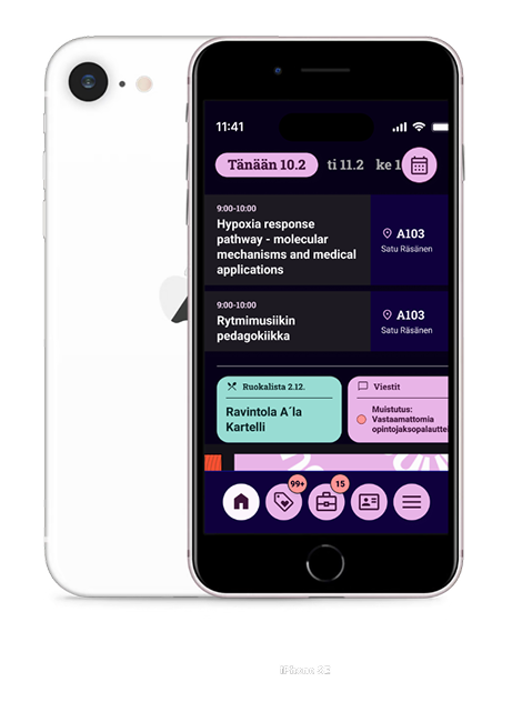
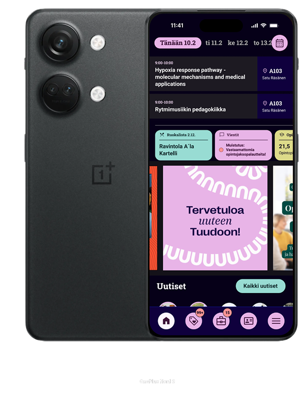
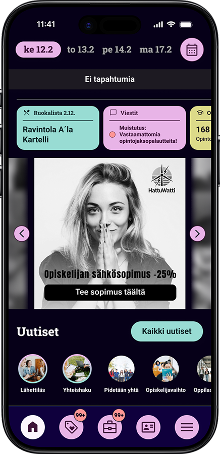
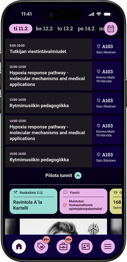
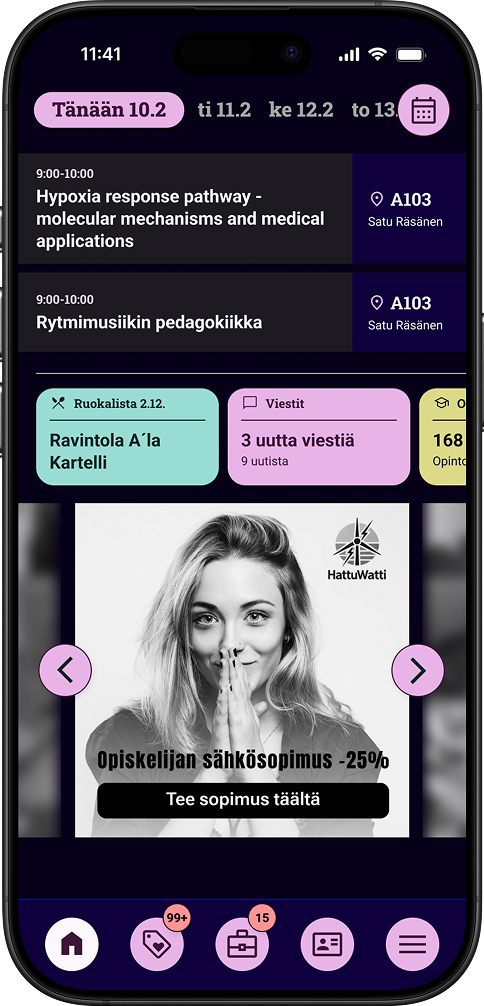
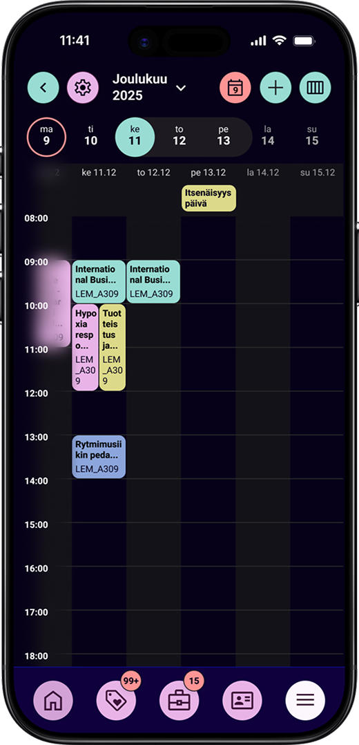
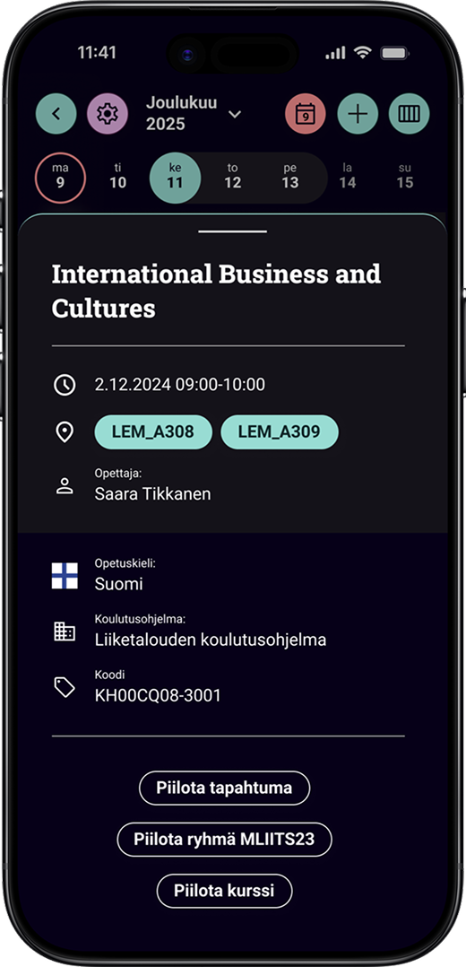
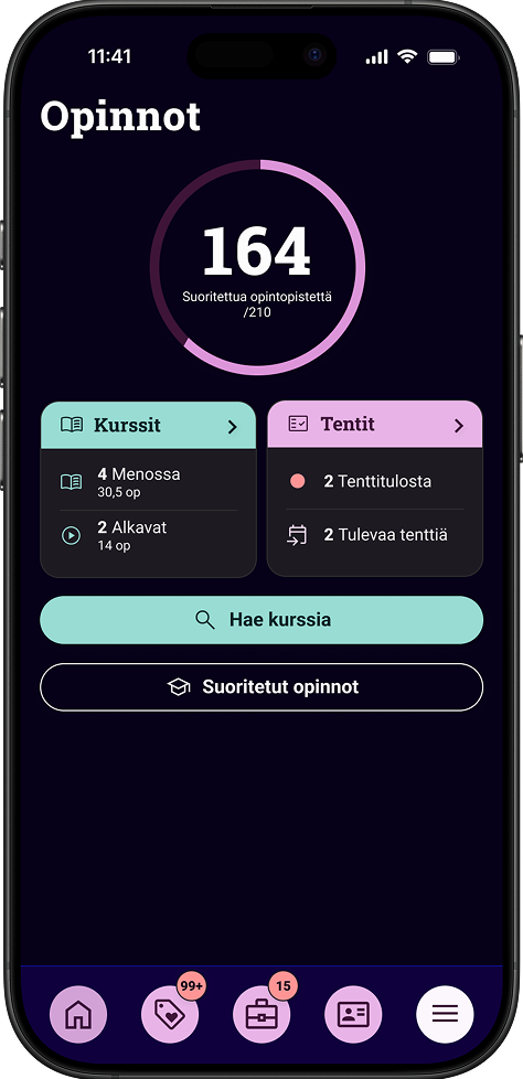
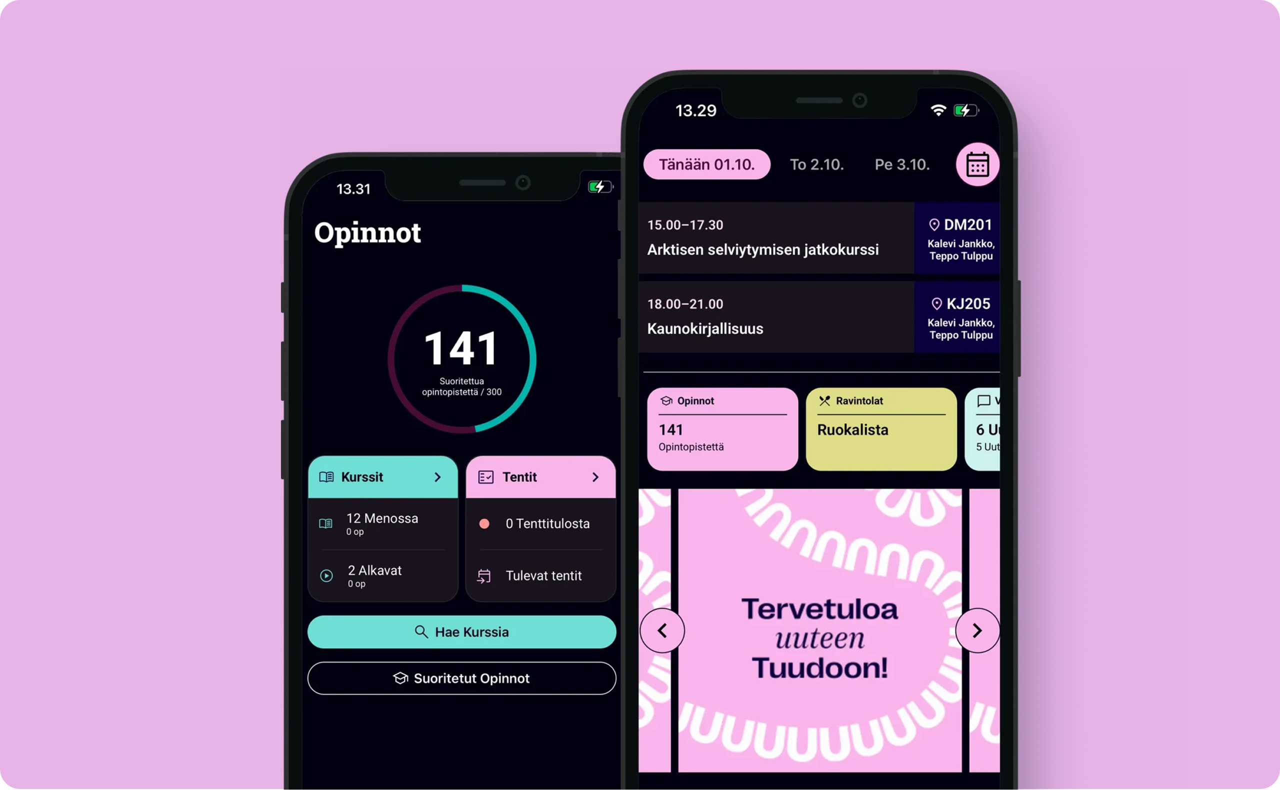
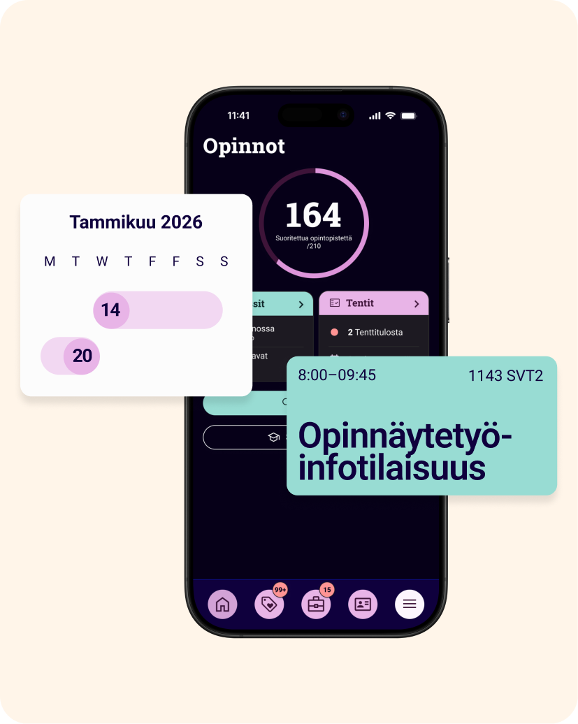
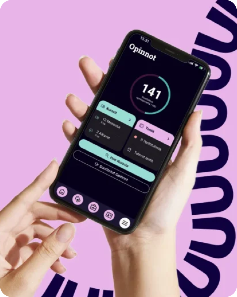
View your study schedule

Course information

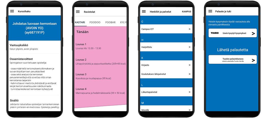
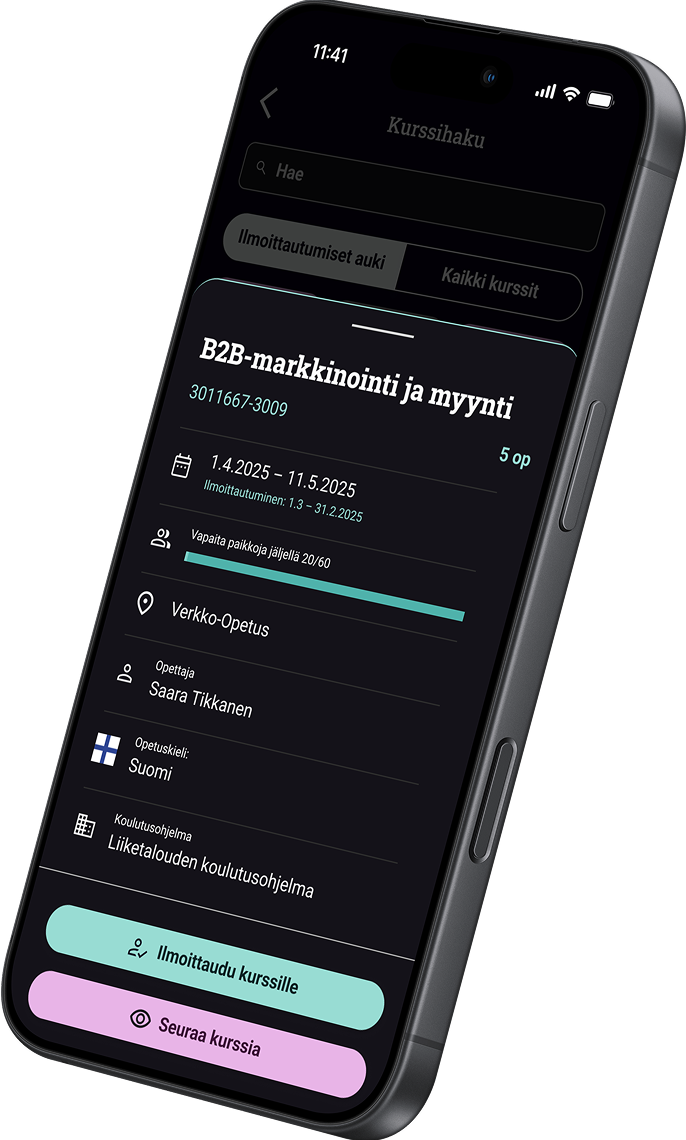
Check course details

Restaurants

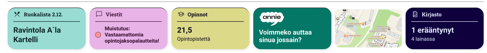
See student restaurant menus

Register for courses and exams

Student ID

Use your digital student ID

Student benefits

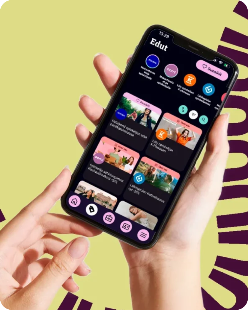
View available student benefits

Find job or internship

Book spaces

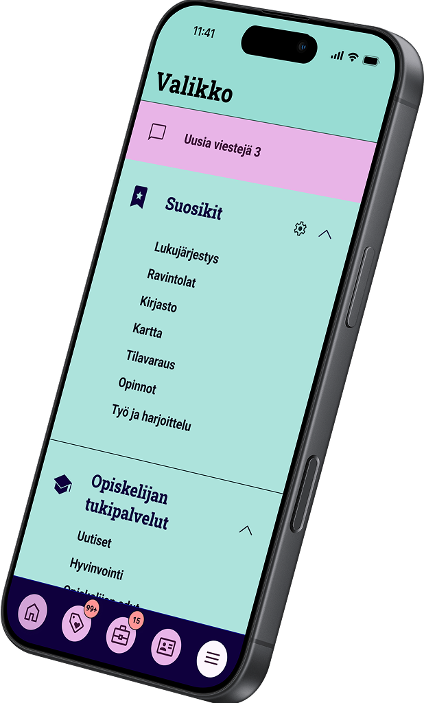
Book study rooms and spaces

Reserve equipment

Reserve shared equipment

Navigate campuses

Find buildings and locations

Library

Access library services

People and services

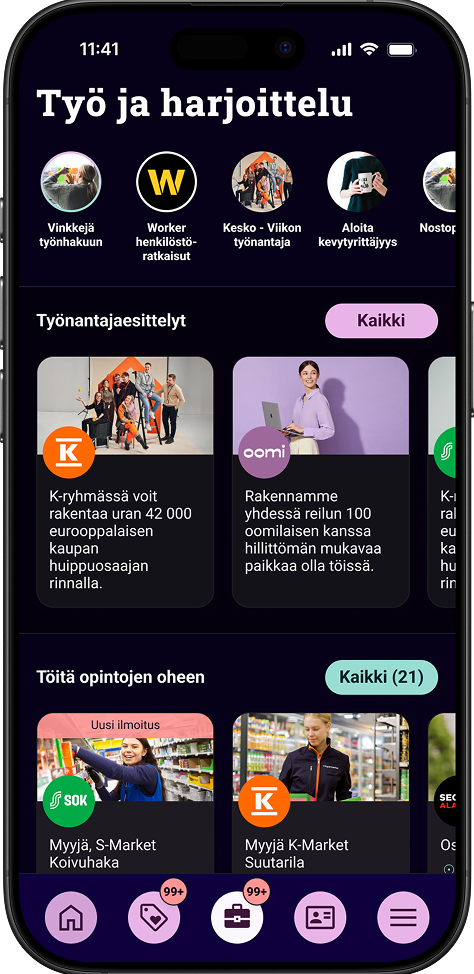
Find contacts and student services

Messages

Read institutional messages

News

Follow news and announcements

The Challenge

Designing for Competing Needs

Tuudo operates at the intersection of multiple stakeholders with partly conflicting goals. Students, educational institutions, and the service itself all rely on the platform for different purposes, often within the same moments of use.

These realities made the redesign significantly more complex than a traditional usability-focused update. The challenge wasn't just optimizing features, but balancing conflicting incentives within a shared interface.

One Interface - Dozens of Visual Identities

Tuudo needed an interface that adapts visually without fragmenting the user experience.

Tuudo is used by dozens of educational institutions, each with its own established visual identity. Colors, typography, and visual tone vary significantly between institutions, yet the service experience needs to remain familiar and predictable for students.

Managing Increasing Service Complexity

Years of iterative feature additions had left the legacy Tuudo app with significant design debt. The interface suffered from fragmented UX patterns and high cognitive load, preventing users from fully leveraging the platform's utility.

Beyond these usability hurdles, the system was visually rigid. It lacked a scalable design language that could seamlessly integrate institutional branding without sacrificing accessibility or typographic clarity.

Designing Change Without Disruption

Finally, because of its scale and frequency of use, Tuudo plays a critical role in students' daily academic life. This made the redesign especially sensitive: disruption to existing users had to be kept to an absolute minimum.

Tuudo is used by dozens of educational institutions, each with its own established visual identity. Colors, typography, and visual tone vary significantly between institutions, yet the service experience needs to remain familiar and predictable for students.

Design Process

Research
Prototype
Build
Pilot

The Process: Co-creation Over Assumption

We moved beyond traditional usability by placing service design and co-creation at the heart of the redesign. By facilitating open dialogue between students and institutional representatives through workshops and interviews, we transformed "conflicting goals" into a collaborative roadmap.

  • Evidence-Based Strategy: We supplemented years of feedback with deep-dive interviews to map stakeholder tensions and establish shared design principles.
  • Agile Co-Design: Design and development ran in parallel. We bypassed "perfect" prototypes in favor of rapid, sprint-based validation of user and stakeholder value, allowing real-world technical constraints to sharpen our design decisions.
  • Real-World Validation: Before launch, we ran a live pilot with real users. This two-week feedback loop allowed us to refine the service based on actual behavior, ensuring the final product was shaped by reality, not assumptions.

The most critical strategic insight was that Tuudo is not a single-user product, but a high-tension ecosystem where students, institutions, and partners intersect.

This called for a structural solution. Rather than permanently prioritizing one stakeholder, the experience was designed to adapt through clear structure, hierarchy, and contextual relevance—supporting institutional goals and commercial growth while preserving student trust and minimizing cognitive load.

Without a rigorous service design approach, we would have only addressed the surface of complex stakeholder needs.

10
years of feedback analysed

Gathered from Tuudo users since day one

12
internal and ecosystem stakeholders engaged

To ensure varying needs and targets

24
user interviews

Exploratory and user testing

3
prototype iterations

Constant learning loop

""
The old and new Tuudo are like night and day. This one is much more modern and sleek. It feels more professional — the kind of app you actually enjoy taking your time to browse.
Quote from user testing

The Solution

A Dynamic, Future-proof Foundation

With limited navigation space, not all stakeholder needs could be given equal visibility at once.

We addressed this need for prioritisation by introducing a dynamic widget carousel on the home view, keeping essential content from studies, communication, jobs, and benefits immediately accessible without permanently favoring any single domain. The result balanced visibility, flexibility, and relevance within a clear, coherent structure.

By designing clear structures, modular components, and adaptable content areas, Tuudo can continue to evolve without repeating the fragmentation of the past.

Clearly color coded widgets

Home view - no upcoming events
Home view - more events, less ads

Integrating Business Needs Without Breaking the Experience

The redesign added essential commercial elements to support Tuudo's long-term sustainability, including large-format home placements, sponsored job and internship listings, and a reimagined benefits section.

Monetization was integrated into the core experience rather than added as a separate layer, with sponsored content kept clear, relevant, and deliberately restrained. Given Tuudo's daily usage, careful control of scale and frequency—especially on the home view—was critical to maintaining a positive student experience.

A Chameleon Interface Facilitating Many Institutional Identities

Rather than creating separate designs for each institution, Tuudo was built on a flexible variable-based design system that allows the interface to change its appearance while preserving structure, usability, and interaction patterns.

Core interface components remain consistent, while institutional identity elements—such as colors, typography, and visual accents—can be applied dynamically. Each configuration supports both light and dark modes without additional redesign work.

This approach allowed Tuudo to:

  • Respect each institution's visual identity
  • Maintain a coherent and recognizable user experience
  • Scale efficiently as new institutions are added
  • Support long-term development without visual fragmentation

Supporting Student Life Beyond Studies

Job and internship listings are a vital part of student life and one of Tuudo's key revenue streams.

The experience was redesigned around how students actually search for work, starting with job alerts that notify them when relevant opportunities appear.

Students typically look for work in two distinct ways: roles related to their field of study, such as internships, and jobs that help fund their studies. Mixing these needs into a single list would reduce relevance, so the experience separates them into clearly defined paths.

A new story-based format enables immersive, full-screen content, including video, while keeping sponsored content transparent and contextual. The result is a smart, intuitive design that serves students first—without compromising commercial value.

Prioritising Immediate Access to What Matters Most

The home view was designed around the most frequent daily task: checking the current day's schedule. The ongoing day's timetable is shown immediately, with up to three classes visible at a glance.

By prioritizing the current day first and placing only the most essential actions around it, the experience enables students to access what they need in seconds. Everything else—services, communication, and commercial content—supports this core task without disrupting it, resulting in a home view that feels instantly useful.

Primary navigation was optimized for one-handed use. The student ID, one of the most frequently used features, is reachable instantly from the bottom navigation.

Hiding Irrelevant Information to Reduce Cognitive Load

The schedule is the most frequently used feature in Tuudo and a daily point of reference for students.

Customization was a key requirement. Students can hide irrelevant courses and filter out unnecessary groups, addressing the reality that institutional systems often include information beyond what an individual student actually attends.

Providing Students with Clarity and Confidence About Academic Progress

Students need clarity and confidence about their academic progress, not fragmented systems.

The studies view unifies credits, courses, exams, and registrations into one clear overview, helping students instantly understand where they stand and what comes next—supporting informed decisions throughout their academic journey

The Results

Despite serving a large, highly active user base, the new Tuudo was adopted rapidly across institutions. The redesign supported a smooth transition for a mission-critical service used daily by students.

The transition was supported through pilot testing and iterative validation with real users. Feedback gathered during the process highlighted improved clarity, faster task completion, and a more modern overall experience.

Rather than making change for its own sake, the redesign reworked core user flows end to end, improving clarity, efficiency, and usability while respecting how the service is used daily.

The service was delivered in phases, prioritizing the most critical daily-use features at launch. Ongoing development continues to refine and expand the service while maintaining stability for core use cases.

90,7%
Adoption Rate

For new Tuudo App

4,75/5
Findability

Rated by test user group

""
This is clearly more structured and better than the previous version.
""
The home view works better. Everything important is easy to see.
""
Tasks are faster to complete in the new version.
""
Everything feels clearer, more refined, and visually more polished. The overall experience is very pleasant.
""
I would definitely recommend it. I don’t see a reason not to use the new Tuudo.
""
Visually, it feels like 2025.
""
It’s nice to see that users were genuinely listened to.

Brand Renewal

From Product to Brand Visuality

The new visual identity is firmly rooted in Tuudo’s strategy; putting students first, staying flexible, and acting boldly in everything the brand does.

The renewal was built around a single guiding idea: every student follows their own path. This concept shaped the entire visual system, ensuring the brand feels personal, adaptive, and supportive – while remaining cohesive and clearly recognizable.

The visual identity extends directly from the product. The colors, typography, and rounded elements used in the application were taken as the foundation and expanded into a scalable visual system. In addition to the application fonts, a dedicated set of brand-level headline typefaces was defined to support communication beyond the app and strengthen recognition across all touchpoints. The result is a bold, memorable, and audience-driven identity that feels trustworthy and genuinely useful, clearly distancing Tuudo from the competition.

Graphic Elements Inspired by Individual Paths

Tuudo’s graphic elements place students at the center, visualizing both their individual study journeys and the connections between students and service providers. The system is built from curves, turns, and loops – metaphors for learning, change, and progress that is rarely linear.

At its core is a recurring curved line derived from the rhythm and form of the Tuudo name itself. This signature “U” element is highly versatile, functioning as subtle background patterns, image frames, or illustrative forms. Lighter sketch-like lines offer a more minimal alternative, while a recognizable cloud element enables playful framing and layered compositions when used selectively. Together, these elements create a dynamic, flexible visual language that reflects movement, individuality, and continuity.

Rooted in Real Student Life

The photography style balances approachability with impact, with the app positioned as the central visual anchor from the outset. Whenever the application appears – whether actively in use or embedded in its environment – it is always clearly foregrounded.

The imagery combines playful, stylized studio photography with authentic lifestyle moments. Academic objects are paired with unexpected details to add personality and narrative, while lifestyle photography grounds the brand in real student experiences: collaboration, problem-solving, shared effort, and achievement. Community, support, and the human side of studying bring warmth and relatability to the visual identity.

Bringing the Brand Back into the Product

The visual identity was designed to live inside the app – not just around it. Brand elements were carefully reintroduced into the interface, particularly in onboarding and entry points, and used only where they naturally support clarity and usability.

A shared icon library is used consistently across the entire brand, reinforcing recognition and coherence. This tight integration ensures the app feels like a natural extension of the wider visual system, creating a unified end-to-end experience. The interface also allows visual snippets to be extracted for external use, making it easy to highlight specific features while staying true to the core brand language.

Try the Prototype

Prototype with all features

Open Prototype

Or download the current production version from the App Store / Google Play. Log in with "Revontuliyliopisto (Demo)"